
- How the Front of a House Sets the First Impression
- Choosing a Color Palette That Suits the Setting
- Materials and Texture on the Outside Walls
- The Role of Rooflines and Trim
- Outdoor Lighting After the Sun Goes Down
- Walkways, Driveways, and the Approach to the House
- Landscaping That Frames Rather Than Hides
- Keeping Every Element in Proportion
A house makes its case before anyone steps inside. The exterior is the part neighbors see every day, the part buyers judge within seconds, and the part that quietly tells people how carefully the rest of the property has been kept. In Las Vegas, where strong sunlight and dry air wear on outdoor surfaces faster than most owners expect, those details carry even more weight. Small choices add up. A faded finish, trim that no longer lines up, or a walkway that has settled unevenly can pull attention away from everything that was done well. Getting the outside right has less to do with spending heavily and more to do with paying attention to the pieces that people actually notice.
Thank you for reading this post, don't forget to subscribe!- How the Front of a House Sets the First Impression
- Choosing a Color Palette That Suits the Setting
- Materials and Texture on the Outside Walls
- The Role of Rooflines and Trim
- Outdoor Lighting After the Sun Goes Down
- Walkways, Driveways, and the Approach to the House
- Landscaping That Frames Rather Than Hides
- Keeping Every Element in Proportion
How the Front of a House Sets the First Impression
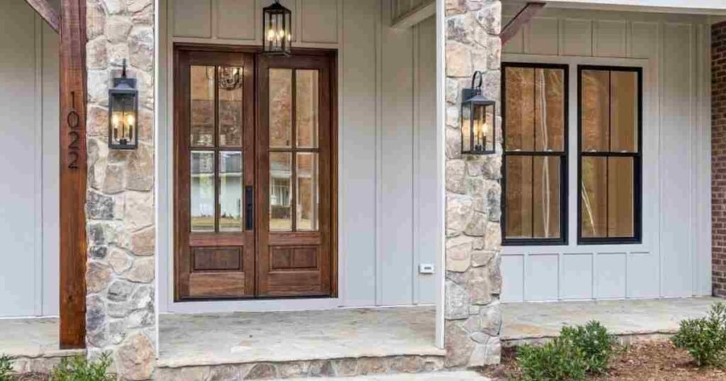
Most people form an opinion about a property from the sidewalk, long before they have seen a single room. The main entrance carries much of that judgment, and tired doors drag the whole front down once the finish has dulled, the frame has shifted, or the panel no longer sits square in its opening. Replacing them is the straightforward fix, because a new unit resets the proportions of the entrance and brings the paint, the hardware, and the surrounding trim back into agreement. If you are also looking for quality replacement doors in Las Vegas, the city has experienced installers who handle the measuring, the permits, the full-frame fitting, and the removal of the old unit. The work is rarely drawn out, and the improvement is visible from the street as soon as the crew packs up.
Choosing a Color Palette That Suits the Setting
Color is the cheapest change available and the easiest one to get wrong. A shade that looked right on a small sample card can read far brighter once it covers an entire wall under direct desert sun. Warm neutrals, soft earth tones, and muted greys tend to hold up better here than cool blues or stark whites, which either wash out or show every speck of dust. The safest approach is three tones: one for the body of the house, one for the trim, and one accent used sparingly. Testing a patch on the wall itself, then checking it in the morning and again at dusk, saves owners from a repaint they did not budget for.
Materials and Texture on the Outside Walls
Flat surfaces across a large wall look cheap, no matter how good the color is. Texture breaks that up and gives the eye somewhere to rest. Stucco finished with a light sand float, stone laid along the base of a wall, or a band of wood siding under a gable all add depth without adding visual noise. The trick is restraint. Two materials working together usually look intentional, while four or five start to look like a sample board. Whatever goes on the wall also has to survive heat, so finishes rated for sun exposure are worth the extra cost over ones that chalk and flake within a few seasons.
The Role of Rooflines and Trim
The roof shapes the outline of the house against the sky, and that outline is what people register from a distance. Clean edges, consistent overhangs, and fascia boards that run straight make a modest house look well built. Sagging gutters, mismatched patches of tile, and trim that has split at the joints do the opposite, and they are noticeable even from across the street. Trim deserves more attention than it usually gets. A crisp painted edge where the wall meets the roof, repeated around the windows, pulls the whole elevation together and makes the paint job look deliberate rather than merely finished.
Outdoor Lighting After the Sun Goes Down
A property has a second appearance that only shows up at night, and many owners never plan for it. Lighting placed well turns a plain elevation into something far more appealing once it gets dark. Low fixtures along a path, uplights angled at a tree or a textured wall, and soft wall washers under the eaves create shape and shadow instead of a flat glare. Warm bulbs flatter stone and stucco. Cool ones make everything look like a parking lot. Fixtures should also be chosen for the heat and the dust, because inexpensive housings corrode quickly, and a half-dead run of path lights looks worse than none at all.
Walkways, Driveways, and the Approach to the House
The route from the street to the house is part of the design, even though it rarely gets treated that way. Cracked concrete, oil stains, and pavers that have tilted out of line undercut everything above them. Resurfacing, resetting loose sections, or replacing a plain slab with banded or stamped concrete can lift the whole approach for a reasonable cost. Width matters too. A path barely wide enough for one person feels mean, while a slightly generous one feels welcoming without taking over the yard.
Landscaping That Frames Rather Than Hides
Planting is meant to frame the house, not swallow it. Overgrown shrubs pressed against the walls block the architecture, trap moisture, and make a well-kept property look neglected. Keeping beds trimmed back, layering low plants in front of taller ones, and leaving clear sight lines to the front of the house all help. Desert planting suits the climate and the water bill, and gravel, agave, and ornamental grasses give structure through every season.
Keeping Every Element in Proportion
Individually good choices can still add up to a mismatched result. A heavy stone base beneath delicate trim, oversized fixtures on a small elevation, or a bold accent color competing with a patterned walkway all create tension that people feel but can’t name. The fix is to step back and look at the house as one object rather than a list of improvements. Scale, repetition, and a limited palette do most of the work. When the materials, the colors, and the proportions agree with one another, even a simple house reads as considered, and that impression lasts far longer than any single upgrade.